A Beginners Perspective Using Semantic UI
27 Feb 2020Near the beginning of the month, my ICS 314 class started using html and css to make shells of webpages. These mock-ups have been very basic. They only included basic <p> (paragraph),
Example of code:
<h1>A history of browsers</h1>
<ul>
  <li><a href="https://docs.google.com/document/d/14qTjKdnAviPcuFimbtG37Fm42NmgrkSpW9dHoV5VK1o/edit">Introduction</a>
  </li>
  <li><a href="https://docs.google.com/document/d/1vRdcV1x-PemcMv3XRickuyeuRjXHkMxgRBBYqYBNcdA/edit">A Brief history of
    IE</a></li>
  <li><a href="https://docs.google.com/document/d/1K3j5HwVhhDmmz63QxDxUNsf3ZjM7eEPuOS-Fj2InnTA/edit">A brief history of
    Firefox</a></li>
  <li><a href="https://docs.google.com/document/d/1JFEs2_Wd8F2TsbBfhhzPALWIRTACoeOzCRtBIpRgbbs/edit">A brief history of
    Chrome</a></li>
</ul>
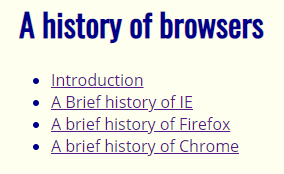
As you can see, this code is straight to the point with no semantic ui. Below is the example of what it looks like on the top part of the screen. The list is pretty plan looking and doesn’t look modern.

Coding without a framework to guide me is definitely a very tedious process. Getting the page styled correctly can require a lot of tweaking to the stylesheet.
Example of Semantic ui code:
<h1><a name ="title"> A history of browsers</a></h1>
<div class="ui fixed top inverted four item menu">
    <a class="item" href="https://docs.google.com/document/d/14qTjKdnAviPcuFimbtG37Fm42NmgrkSpW9dHoV5VK1o/edit">Introduction</a>
    <a class="item" href="https://docs.google.com/document/d/1vRdcV1x-PemcMv3XRickuyeuRjXHkMxgRBBYqYBNcdA/edit">A Brief history of IE</a>
    <a class="item" href="https://docs.google.com/document/d/1K3j5HwVhhDmmz63QxDxUNsf3ZjM7eEPuOS-Fj2InnTA/edit">A brief history of Firefox</a>
    <a class="item" href="https://docs.google.com/document/d/1JFEs2_Wd8F2TsbBfhhzPALWIRTACoeOzCRtBIpRgbbs/edit">A brief history of Chrome</a>
</div>

This image shows a top black bar with the same four elements as above, but as a cleaner top bar with color and each evenly spaced. I Did this by calling the semantic command in the ‘class’ section of the <div> tag.
Conclusion:
Semantic ui has proven to be useful when needing a quick ui set up without having to spend all the time moving things around the page with css. Having the auto css makes it very convenient. My favorite part of semantic is all the icons they allow you to use. I will be looking forward to using semantic in the future on my own projects.